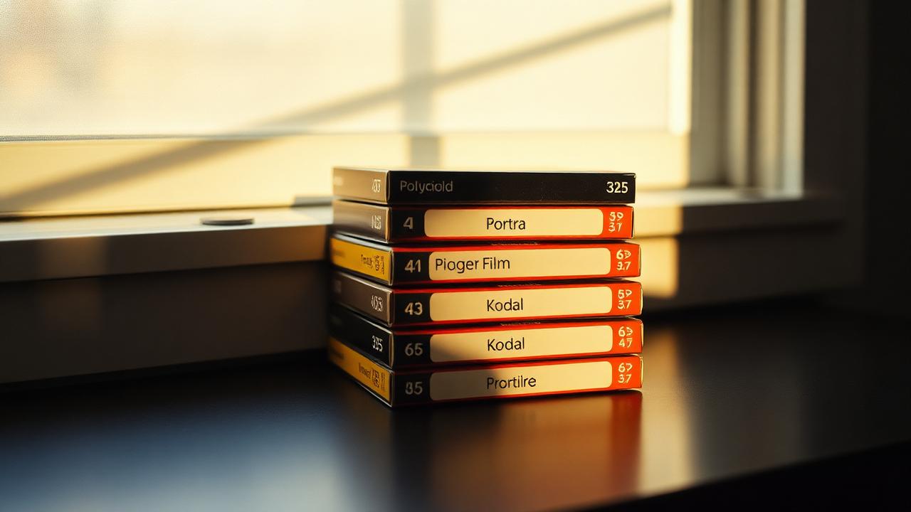
Film filters are not interchangeable. A look that flatters a bright window-lit portrait can flatten a nightclub photo, and a high-contrast black-and-white that snaps a street scene into focus can murder a soft, candlelit dinner. The trick is to match the filter family to the light you actually have, not the light you wish you had.
Below is a working map of which kinds of looks fit which kinds of light, with concrete examples from FLASHFRAME's filter set and a few notes on why each pairing works — so you can make good calls even on filters that are not on this list.
Daylight, soft and warm
Window light, golden hour, overcast afternoons. The light is even, the shadows are gentle, and skin tones are already pleasant. Anything with too much extra contrast will push shadows into pure black and lose the softness that defined the original scene.
Best filter families:
- Fuji-style "Classic" recipes. Slight warm shift, low-to-medium contrast, gentle highlight roll-off. Keeps skin natural.
- Kodak-style portrait looks (Portra-like). Warm, cream-coloured highlights and a soft tonal curve. Forgiving on faces.
- Polaroid-style instant looks. Slightly faded blacks, warm midtones, low saturation in the greens. Reads as "memory" rather than "documentary".
Avoid heavy black-and-white or VHS-style looks here — the source light is already gentle and these filters fight that quality instead of using it. If you want monochrome in soft light, pick a low-contrast B&W (Ilford XP2-style) rather than a punchy one.
Direct sun and harsh daylight
Mid-day sun, beach photos, white walls in summer. The light is contrasty, the shadows are hard, and colours are already vivid. The filter's job is to tame, not amplify.
Best families:
- Faded film looks. Lifted blacks, slightly desaturated, a hint of haze. Softens the harshness without making the photo look dim.
- Black-and-white with medium contrast. Hard light is what classic black-and-white was built for. Strong shadows become a feature, not a problem.
- Slide-film looks (Velvia-like) — cautiously. Can work on landscapes where you want the saturation, but push skin tones toward sunburn. Skip for portraits.
Skip ultra-saturated or HDR-style looks. The scene already has more contrast than your camera can comfortably hold; cranking it further will clip highlights into pure white and destroy any texture in the brightest parts of the frame.
Indoor warm light at night
Lamps, candles, restaurant interiors, your living room after sunset. The dominant light is warm, the colour temperature is low, and the camera is probably already at a high ISO. Filters here should embrace the warmth and the grain, not fight them.
Best families:
- Cinematic warm filters. Push warmth further, deepen the shadows, leave grain visible. Reads as intimate, not noisy.
- Disposable-camera looks. Built around exactly this situation — warm tungsten light, grainy texture, slightly punchy contrast. Authentic to the format.
- CCD-style early-digital looks. Slightly green-yellow cast, heavier shadows, lower dynamic range. Recreates the feel of the digital cameras built for these interiors around 2004.
The mistake here is trying to "fix" the warm colour cast by cooling the image toward neutral. That produces a photo that looks like it was shot under a hospital light. The warmth is the point — commit to it.
Indoor cool or fluorescent light
Office lighting, supermarkets, modern apartments with daylight LEDs. The light is colour-accurate but emotionally cold. Filters should add warmth or commit to the cold look on purpose.
Best families:
- Warm-shifting filters. Anything that nudges the white balance toward orange will instantly humanise the scene.
- Black-and-white. If you cannot warm the light, remove colour entirely. B&W sidesteps the bad colour temperature and refocuses attention on shape and texture.
- Teal-and-orange cinematic. If you actively want the cold look — think Michael Mann's Collateral — push it. Half-committed cool tones look like a camera error; fully-committed cool tones look intentional.
Very low light
Bars, clubs, the inside of a movie theatre lobby. The camera is struggling, noise is unavoidable, and detail is limited. Trying to clean this up with a sharp, modern filter usually fails — the noise becomes the focus, and the image reads as a broken photo instead of a mood.
Best families:
- VHS / chromatic-aberration looks. Lean into the bad signal. Heavy colour fringing, scan lines and softness disguise sensor noise as intentional texture.
- High-grain monochrome. Black-and-white film at ISO 3200 was built for this kind of light. The grain looks deliberate, the contrast hides shadow noise.
- Flash-forward disposable looks. If a flash actually fired, filters that mimic on-camera flash (harsh foreground, black background) will feel truthful rather than fake.
Mixed light
Warm lamps and a cool window in the same frame. Neon signs against tungsten street lights. This is where filters get interesting: the goal is usually to pick a side. Warm the whole frame and the window turns romantic; cool the whole frame and the lamps become moody counterpoints. Trying to neutralise both usually produces mud.
If you cannot decide, black-and-white with a medium contrast curve is the safest choice — it removes the colour conflict entirely and lets the composition carry the frame.
A quick decision rule
- Light is soft and warm? Use a Classic or Portra-like filter.
- Light is harsh and bright? Use a faded film or medium-contrast B&W.
- Light is warm and dim (lamp, candle)? Use a disposable, CCD or cinematic warm filter.
- Light is cold and clinical? Warm it up, or commit to B&W.
- Light is barely there at all? VHS or high-grain B&W.
- Light is mixed? Pick a side. B&W if you cannot.
FAQ
Should I match the filter to the outfit or to the light? To the light. Colour clashes between outfit and filter are usually fixable in the same filter family (a warmer or cooler variant); a mismatch between filter and light source is not — it makes the whole frame feel wrong.
Is grain the same as noise? No. Grain is a texture with a random but even distribution, and it sits on top of the image without obscuring detail. Digital noise is uneven, concentrates in shadows and looks like colour speckle. A good film filter adds grain and masks noise; a bad one just adds more noise.
Do filters look different on different skin tones? Yes. Heavily warm filters can push medium and dark skin tones toward orange in a way that reads as unflattering. Test any new filter on a range of faces before committing to it for a shoot — Portra-style looks are usually the safest across skin tones because they were engineered for exactly that reason.
Can I stack filters? Rarely a good idea. Two filters usually double contrast and saturation past what the image can carry. If you want a hybrid look, pick the closest single filter and adjust exposure, not the filter stack.
Further reading
- Lighting for vintage-looking photos
- Grain and light leaks — how much is too much
- Better photobooth photos
Filters are emotional decisions, but they sit on top of optical reality. Read the light first, pick the filter second, and you will get a strip of photos that look like they were all taken on purpose.