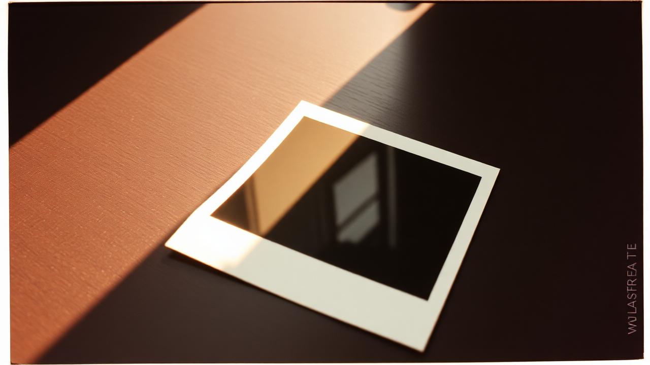
Not every white-bordered square is a Polaroid. The Polaroid frame most people picture — square image, thin top border, fat bottom border — is specifically the SX-70 / 600 family, which shipped between 1972 and the mid-2000s and defined what "a Polaroid" looks like for two generations. The proportions are not arbitrary or decorative; they were dictated by where the chemistry pod sat inside the film pack. Understanding that is the difference between a digital export that reads as a Polaroid and one that reads as a generic Instagram template with a white border slapped on.
SX-70 and 600: the classic square
The most iconic Polaroid frame holds a 79 × 79 mm image inside an 88 × 107 mm card. The top, left and right borders are roughly equal and narrow — around 4 to 5 mm. The bottom border is much wider, around 24 mm, because that is where the chemistry pod was tucked and where the rollers pushed developer across the image on the way out of the camera. The wide bottom strip became the writing area entirely by accident: there was nowhere else to put a caption without covering the picture.
For a digital Polaroid-style export, that proportion — image-to-bottom-border ratio of roughly 3:1, with a square image — is the single most important thing to get right. A square image with equal borders on all four sides reads as "Instagram", not "Polaroid". People will not consciously articulate why the frame feels wrong, but they will feel it.
Spectra and Image: the wide format
Polaroid Spectra (sold as "Image" in Europe) used a 91 × 73 mm rectangular image inside an even larger card, closer to a 5:4 ratio. It was aimed at portrait shooters who wanted more room above the head than the square allowed, and it was popular with real estate agents in the 1990s for exactly the same reason. Spectra film was discontinued in 2008 and never revived, so it is now essentially a vintage-scan format — you will see it in family albums from the late 80s and 90s, but nobody is making new Spectra prints today.
If you are trying to evoke a specific decade in a digital collage, Spectra proportions read as "late 80s / early 90s" the way SX-70 reads as "70s". The wider aspect ratio also suits two-person portraits and landscape crops that the square would clip.
Go and i-Type: the modern square
Current Polaroid Go film is a smaller version of the classic square (47 × 46 mm image), aimed at a pocket-sized camera launched in 2021. i-Type is the same physical dimensions as 600 film but without the built-in battery, which shaved a small amount off the per-pack cost when Polaroid Originals (now Polaroid) resurrected the format in 2017. For digital export purposes, both render at the classic SX-70 / 600 proportions — the visible frame looks identical. Pick the proportion you want to convey (classic square with fat bottom), not the specific pack name.
Why the border is doing real work
The fat bottom border is not decoration. It is the difference between a photo that looks like a memory object and a photo that looks like a phone screenshot. Three reasons:
- It frames the image. Negative space below the photo forces the eye to stop at the image edge instead of wandering off the bottom. A photo with equal borders feels like it is floating on a page; a Polaroid feels like it is sitting on a table.
- It invites annotation. Even an empty border implies a caption could go there. People treat bordered photos as artifacts to write on, not feed items to scroll past. The border is a psychological cue as much as a visual one.
- It dates the format. The fat-bottom border was a manufacturing quirk from the 1970s. Keeping it ties the photo to that visual era whether the picture inside was shot on Portra 400 or a webcam this morning.
Colour of the border
Real Polaroid borders are not pure white. They are a slightly off-white with a faint warm tint — closer to #f4f0e8 than to #ffffff. This is partly the paper stock and partly age; even a brand-new pack has a warmer border than a laser-printed page. Digital exports that use pure white borders look sterile next to a real Polaroid scan. A tiny warm shift (a few percent yellow, a few percent red) closes most of the gap.
Common mistakes when faking it
- Equal borders on all four sides. Reads as a generic photo frame, not Polaroid.
- Pure white border. Too clinical. Add a faint warm tint.
- Drop shadow that suggests the photo is hovering. Polaroids sit flat. Shadows should be short and directly beneath the edge, if used at all.
- Date stamp on the image area. Dates go on the bottom border, in handwriting or a typewriter font — never overlaid on the picture itself.
- Perfectly square corners. Real Polaroid corners are very slightly rounded. A 2 to 3 px corner radius on a 1000 px export is close enough.
One frame style per project
Mixing SX-70 squares and Spectra rectangles in the same set undercuts both. The eye reads the inconsistency as amateur, not eclectic. If you are making a wall, a feed grid or a printed booklet, commit to one Polaroid frame style and stay with it. Variation belongs in the photos themselves — different subjects, different light, different moods — not in the frames around them.
Frequently asked questions
What size should I export a digital Polaroid at?
For screen use, 1000 × 1200 px is plenty. For print, aim for 300 DPI at the target physical size — a 3.5 inch print needs a 1050 px square image inside a 1050 × 1260 px card.
Can I add a caption to the border?
Yes, and you should. A short caption in a handwritten or typewriter font on the bottom border is how Polaroids were always used. Leave 4 to 6 mm of clearance from the image edge and from the card edge so the text does not crowd either.
Which frame style should I pick for a wedding album?
SX-70 / 600 classic square. It is the most legible reference and the format most guests will recognise. Spectra is a stylistic choice; the classic square is the safe default.
Do modern Polaroid cameras produce different frames?
Physically the current Polaroid Now and I-2 cameras use i-Type or 600 film, which is the classic square. Polaroid Go uses a smaller square with the same proportions. There is no current Polaroid camera that produces the Spectra rectangle.
Further reading
- Polaroid's own film specifications page for exact card dimensions.
- The Impossible Project archive for historical SX-70 examples.